7 💻 Essentials of Data Wrangling and Basic Statistics
Data wrangling, also known as data cleaning, involves the preparation steps prior to fitting any statistical model. This is essential since healthcare data often comes in a raw, messy format, and we usually don’t need all the data available. We might only need a subset, such as specific rows or columns.
In this tutorial, we will learn how to clean and wrangle healthcare-related datasets using both base R and the dplyr package, along with basic descriptive statistics. Let’s start from the basics!
7.1 1. Basic Operations in R
Let’s start with some simple operations:
3 + 5
#> [1] 8
12 / 7
#> [1] 1.714286
You can store the result into objects:
result <- 3 + 5
result
#> [1] 8
Print the result:
print(result)
#> [1] 8
Modify the result:
result <- result * 3.1415
print(result)
#> [1] 25.1327.2 2. Working with Vectors
Vectors are a fundamental data structure in R. Let’s create a vector of blood pressure readings:
blood_pressure <- c(120, 135, 142, 130, 125)
blood_pressure
#> [1] 120 135 142 130 125
7.2.1 Accessing Vector Elements
You can access elements in a vector using square brackets []. For example:
7.2.2 Conditional Subsetting
Let’s select only the readings greater than 130:
high_bp <- blood_pressure[blood_pressure > 130]
print(high_bp)  # Output: [1] 135 142 130
#> [1] 135 142
7.2.2.1 Advanced Conditional Subsetting
You can combine multiple conditions to filter more complex subsets. For example, let’s select blood pressure readings that are greater than 130 and less than 150:
subset_bp <- blood_pressure[blood_pressure > 130 & blood_pressure < 150]
print(subset_bp)  # Output: [1] 135 142
#> [1] 135 142
You can also use the | (or) operator to select readings that are either below 125 or above 160:
extreme_bp <- blood_pressure[blood_pressure < 125 | blood_pressure > 160]
print(extreme_bp)  # Output: [1] 120 165 170
#> [1] 120
7.3 3. Data Frames
Data frames are similar to tables or spreadsheets, making them suitable for storing patient data. Let’s create a simple data frame:
patients <- data.frame(
  ID = c(1, 2, 3),
  Name = c("John", "Alice", "Bob"),
  Age = c(30, 25, 28),
  BloodPressure = c(120, 130, 125)
)

print(patients)
#>   ID  Name Age BloodPressure
#> 1  1  John  30           120
#> 2  2 Alice  25           130
#> 3  3   Bob  28           125
7.3.1 Viewing the First Few Rows
To view the first few rows of a data frame, use the head() function:
head(patients)
#>   ID  Name Age BloodPressure
#> 1  1  John  30           120
#> 2  2 Alice  25           130
#> 3  3   Bob  28           125
You can specify the number of rows you want to see:
head(patients, n = 2)
#>   ID  Name Age BloodPressure
#> 1  1  John  30           120
#> 2  2 Alice  25           130
7.3.2 Using Built-in Datasets
R comes with several built-in datasets that can be accessed using the data() function. For example, to load the iris dataset:
7.3.3 Accessing Data Frame Elements
You can access elements in a data frame using the $ operator:
patient_names <- patients$Name
print(patient_names)  # Output: [1] "John" "Alice" "Bob"
#> [1] "John"  "Alice" "Bob"
Or using square brackets:
first_patient <- patients[1, ]
print(first_patient)
#>   ID Name Age BloodPressure
#> 1  1 John  30           120
7.3.4 Creating and Modifying Columns
You can create new columns based on existing ones. For example, let’s add a column to categorize patients based on their blood pressure:
patients$BP_Category <- ifelse(patients$BloodPressure > 140, "High", "Normal")
print(patients)
#>   ID  Name Age BloodPressure BP_Category
#> 1  1  John  30           120      Normal
#> 2  2 Alice  25           130      Normal
#> 3  3   Bob  28           125      Normal
To remove a column, simply assign NULL to it:
patients$BP_Category <- NULL
print(patients)
#>   ID  Name Age BloodPressure
#> 1  1  John  30           120
#> 2  2 Alice  25           130
#> 3  3   Bob  28           125
7.4 4. Data Manipulation with dplyr
The dplyr package provides a more intuitive way to manipulate data. Let’s load it and use it to filter and select data:
7.5 5. Importing and Exporting Data
It is crucial to know how to import and export data, as you’ll often work with datasets stored in files.
7.5.1 Importing Data from a CSV File
To import a CSV file into R, use the read.csv() function:
7.5.2 Exporting Data to a CSV File
To save your data frame as a CSV file:
# Export the data frame to a CSV file
write.csv(patients, "path/to/save_file.csv", row.names = FALSE)
7.6 6. Data Cleaning
7.6.1 Handling Missing Data
In healthcare, missing data can occur for several reasons. For example, a nurse might forget to record a patient’s temperature during a routine checkup, or a field might be left empty due to lack of information. Missing data can affect the quality of your analysis and may appear in R in different forms, such as NA (Not Available) or NULL (indicating the absence of an object).
In R, NA is used to represent missing values in vectors and data frames. It’s important to handle missing data appropriately, as it can bias your results. Common strategies include removing missing data, imputing values, or using statistical models that handle missingness.
7.6.2 Checking for Missing Values
You can use is.na() to check for missing values:
7.7 7. Working with Factors
In healthcare, many variables are categorical, such as disease type or treatment group. Factors are used in R to handle categorical data.
7.8 8. Descriptive Statistics
7.8.1 Measures of Central Tendency
- Mean: The mean is the sum of all values divided by the total number of observations.
- Median: The median is the central value in an ordered set of data.
- Mode: In R, there is no built-in function for the mode, but we can calculate it as follows:
7.8.2 Measures of Variability
- Variance: Variance measures the dispersion of data from the mean.
- Standard Deviation: Standard deviation is the square root of the variance and indicates how spread out the data is around the mean.
7.8.3 Correlation
Correlation measures the strength and direction of the relationship between two variables. For example, the relationship between age and blood pressure.
7.8.4 Scatter Plot for Correlation
plot(patients$Age, patients$BloodPressure,
     main = "Scatter Plot of Age vs Blood Pressure",
     xlab

 = "Age",
     ylab = "Blood Pressure (mm Hg)",
     pch = 19)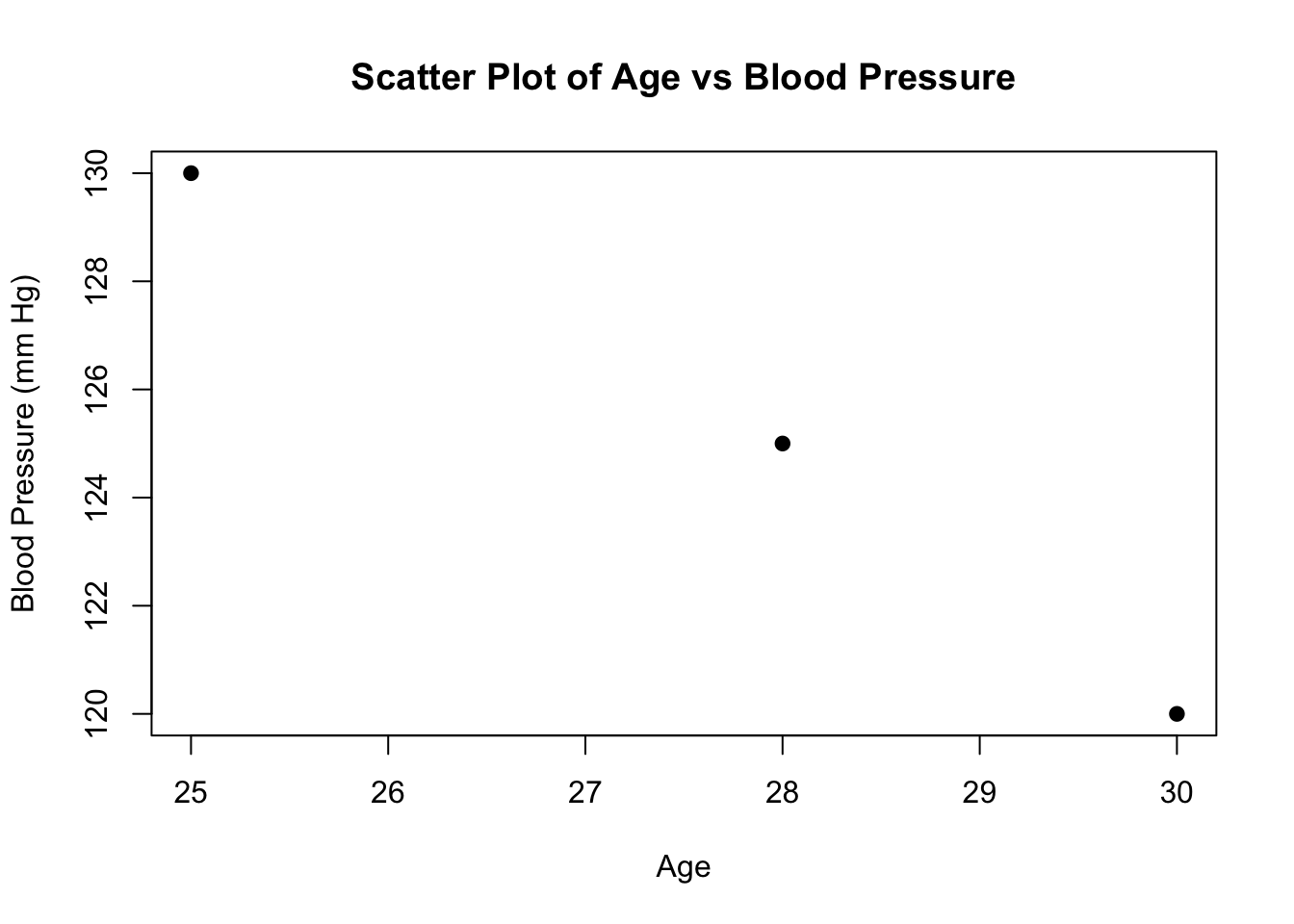
7.8.5 Interpreting Graphs
Histogram: Shows the distribution of a single numeric variable. The height of each bar represents the frequency of values in each bin.
Scatter Plot: Displays the relationship between two numeric variables. Each point represents an observation, and the pattern of the points shows the nature of the relationship.
Boxplot: Visualizes the distribution of a variable through its quartiles, identifying outliers. Useful for comparing distributions between different groups.
Pie Chart: Represents the proportions of categories within a whole, showing how each category contributes to the total.
7.9 9. Visualizing Data with Boxplots
A boxplot, or box-and-whisker plot, is a graphical representation used to display the distribution of data based on a five-number summary: minimum, first quartile (Q1), median, third quartile (Q3), and maximum. It helps identify outliers and the spread of the data.
7.9.1 Clinical Example: Visualizing Blood Pressure
Let’s visualize the distribution of systolic blood pressure readings for a group of patients:
blood_pressure <- c(120, 130, 135, 140, 145, 150, 155, 160, 165, 170)

boxplot(blood_pressure,
        main = "Boxplot of Systolic Blood Pressure",
        ylab = "Blood Pressure (mm Hg)",
        col = "lightblue")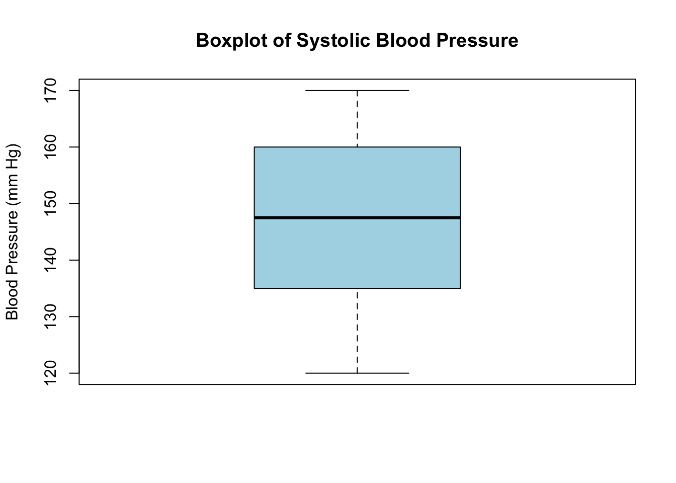
In this example: - The box represents the interquartile range (IQR), containing the middle 50% of the data. - The line inside the box shows the median value. - The “whiskers” extend to the minimum and maximum values within 1.5 * IQR from Q1 and Q3. - Data points outside this range are considered outliers, useful in identifying patients with unusually high or low blood pressure.
7.10 10. Other Basic Plots
7.10.1 Histogram
An easy way to visualize the distribution of numeric data is by using a histogram. For example:
# Histogram of blood pressure readings
hist(blood_pressure,
     main = "Distribution of Blood Pressure",
     xlab = "Blood Pressure (mm Hg)",
     col = "lightgreen")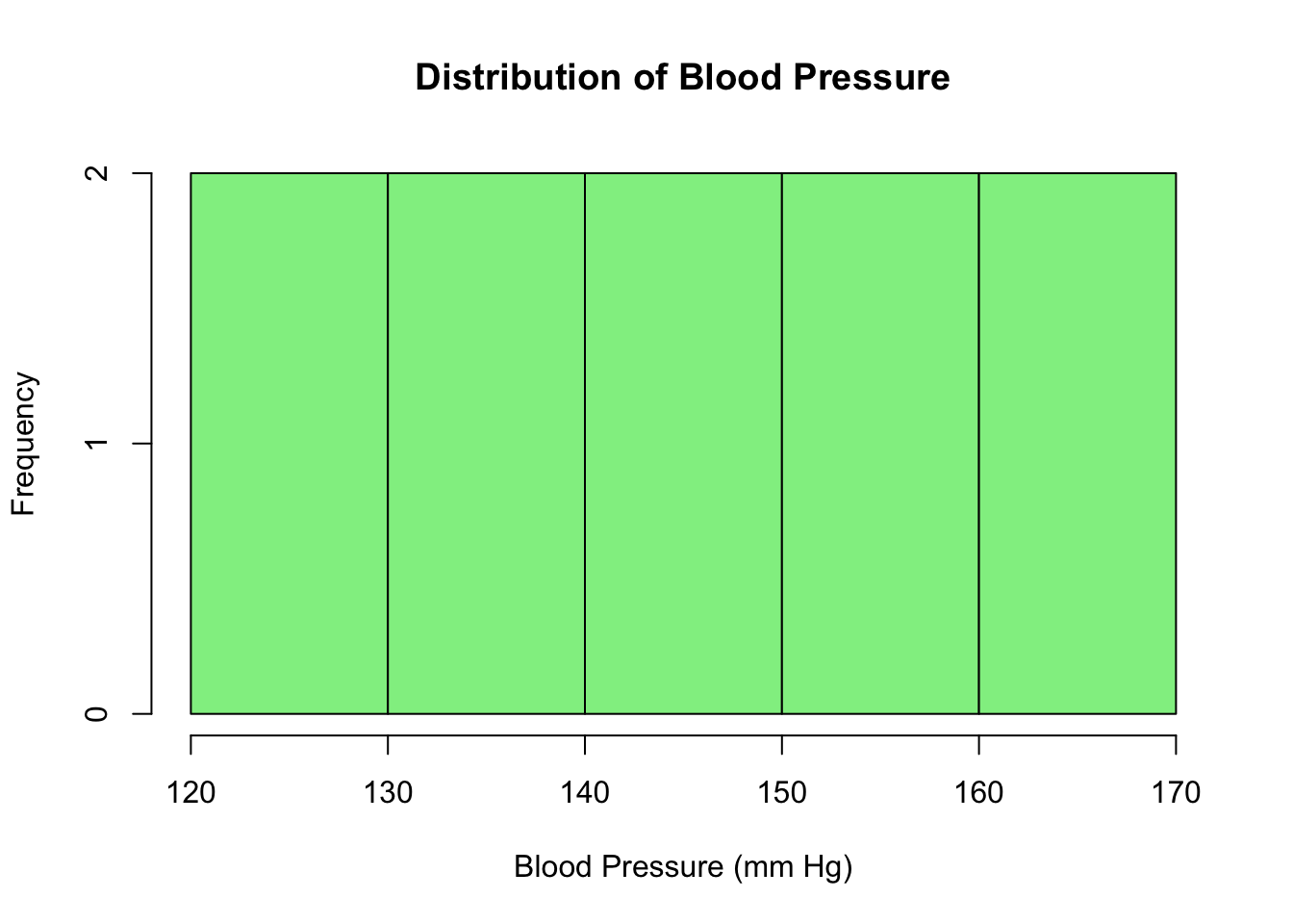
7.10.2 Bar Plot
For categorical data, a bar plot can be useful:
# Count of diseases
barplot(table(patients$Disease),
        main = "Count of Diseases",
        xlab = "Disease",
        ylab = "Number of Patients",
        col = "lightcoral")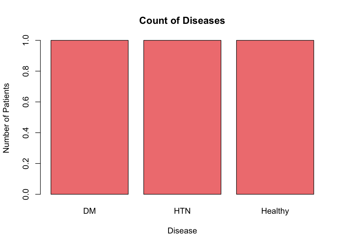
7.10.3 Pie Chart
A pie chart can be used to represent the proportions of categories within a whole. For example, let’s visualize the proportion of different diseases:
# Pie chart of diseases
pie(table(patients$Disease),
    main = "Proportion of Diseases",
    col = c("lightblue", "lightgreen", "lightpink"))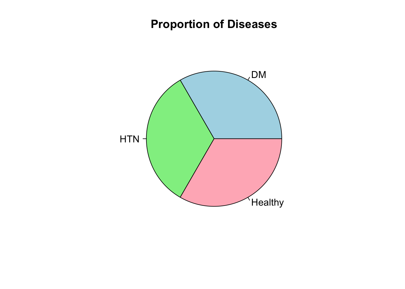
7.11 11. Summarizing Data
7.11.1 Data Frame Structure
Use str() to view the structure of a data frame:
# View structure of data frame
str(patients)
#> 'data.frame':    3 obs. of  5 variables:
#>  $ ID           : num  1 2 3
#>  $ Name         : chr  "John" "Alice" "Bob"
#>  $ Age          : num  30 25 28
#>  $ BloodPressure: num  120 130 125
#>  $ Disease      : Factor w/ 3 levels "DM","HTN","Healthy": 1 2 3
7.11.2 Summary Statistics
You can get a quick summary of all columns using summary():
# Summary of the data frame
summary(patients)
#>        ID          Name                Age
#>  Min.   :1.0   Length:3           Min.   :25.00
#>  1st Qu.:1.5   Class :character   1st Qu.:26.50
#>  Median :2.0   Mode  :character   Median :28.00
#>  Mean   :2.0                      Mean   :27.67
#>  3rd Qu.:2.5                      3rd Qu.:29.00
#>  Max.   :3.0                      Max.   :30.00
#>  BloodPressure      Disease
#>  Min.   :120.0   DM     :1
#>  1st Qu.:122.5   HTN    :1
#>  Median :125.0   Healthy:1
#>  Mean   :125.0
#>  3rd Qu.:127.5
#> Max. :130.07.12 12. Merging Data Frames
Sometimes, you’ll need to combine patient data from different sources. Use the merge() function:
# Patient details
patient_details <- data.frame(
  ID = c(1, 2, 3),
  Name = c("John", "Alice", "Bob")
)

# Patient records
patient_records <- data.frame(
  ID = c(1, 3, 4),
  BloodPressure = c(120, 125, 135)
)

# Merge on "ID"
merged_data <- merge(patient_details, patient_records, by = "ID", all = TRUE)
print(merged_data)
#>   ID  Name BloodPressure
#> 1  1  John           120
#> 2  2 Alice            NA
#> 3  3   Bob           125
#> 4  4  <NA>           135
7.13 13. Data Export
Finally, save your cleaned or modified data back to a file:
# Save the merged data frame to a CSV file
write.csv(merged_data, "merged_patient_data.csv", row.names = FALSE)
7.14 Exercises
Exercise 6.1 Given a vector of numeric data representing cholesterol levels, access and print the third and fifth elements.
cholesterol_levels <- c(180, 220, 195, 250, 205)Exercise 6.2 Create a data frame for the following patient data and then print the entire data frame:
- Name: Emma, Oliver, Ava
- Age: 45, 50, 37
- BMI: 22.5, 28.7, 25.3
Exercise 6.3 Using the data frame patients, filter and print only the rows where BloodPressure is greater than 125.
Exercise 6.4 From the given data frame, select and print the Name and Age columns using dplyr’s select() function.
Exercise 7.1 Create a data frame with patient IDs and blood pressure readings. Introduce some NA values, then use na.omit() to remove them and print the cleaned data frame.
Exercise 7.2 Create two data frames: one with patient IDs and ages, and another with patient IDs and cholesterol levels. Merge them using the merge() function.
Exercise 7.3 Using the data frame patients, calculate the mean and standard deviation of the BloodPressure column.
Exercise 7.4 Create a scatter plot of Age vs. BMI using ggplot2 for the data frame created in Exercise 2.
7.15 Solutions
Answer to Exercise 6.1:
element3 <- cholesterol_levels[3]
element5 <- cholesterol_levels[5]

print(element3)  # Output: [1] 195
print(element5)  # Output: [1] 205
Answer to Exercise 6.2:
patient_data <- data.frame(
    Name = c("Emma", "Oliver", "Ava"),
    Age = c(45, 50, 37),
    BMI = c(22.5, 28.7, 25.3)
)

print(patient_data)
Answer to Exercise 6.3:
high_bp_patients <- subset(patients, BloodPressure > 125)
print(high_bp_patients)
Answer to Exercise 6.4:
names_and_ages <- patients %>%
    select(Name, Age)
print(names_and_ages)
Answer to Exercise 7.1:
patient_bp <- data.frame(
    ID = 1:5,
    BloodPressure = c(120, 130, NA, 140, NA)
)

cleaned_bp <- na.omit(patient_bp)
print(cleaned_bp)
Answer to Exercise 7.2:
patient_ages <- data.frame(
    ID = c(1, 2, 3),
    Age = c(30, 25, 28)
)

patient_chol <- data.frame(
    ID = c(2, 3, 4),
    Cholesterol = c(220, 195, 250)
)

merged_data <- merge(patient_ages, patient_chol, by = "ID", all = TRUE)
print(merged_data)
Answer to Exercise 7.3:
bp_summary <- patients %>%
    summarise(
        mean_bp = mean(BloodPressure, na.rm = TRUE),
        sd_bp = sd(BloodPressure, na.rm = TRUE)
    )
print(bp_summary)
Answer to Exercise 7.4:
ggplot(patient_data, aes(x = Age, y = BMI)) +
    geom_point() +
    labs(title = "Age vs. BMI", x = "Age", y = "BMI")